How busy is a system?
If one could measure a system at the most detailed level, then a system would either be busy doing "something" or it would be idle doing "nothing". Curiously enough, moving from this fact to the reporting of system utilisation is beyond some of the people that I have met over the years.
If a system is reported as being 50% busy, then there are IT "professionals" out there that cannot comprehend how this can be. As we've already said, at the finest granularity the system is either busy (100% utilised) or idle (0% utilised). It is a simple enough concept to appreciate that if the system is reported as 50% busy, then for half of the period for which it is being reported it was idle and for the other half of the time it was fully busy.
Understanding this concept leads naturally to understanding how a system can be 67.4% busy, or 17% busy, etc, etc.
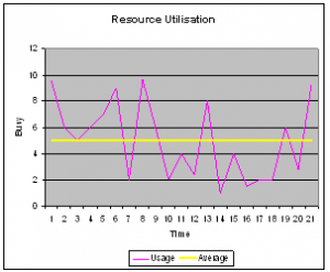
So... a major facet of system reporting that must be understood is the time interval over which the reporting is taking place. Is the system 67% busy over a minute, hour, or day? What is actually being reported is the AVERAGE utilisation over that time period.
Averages can be really useful and are used extensively in statistical reporting in all walks of life. However,  sometimes, they can be misleading. It is said that, on average, each family has 2.4 children. I’ve checked all the people I know, and none of them have 0.4 of a child (although many have either 2 or 3 children). As you can see, the average gave a rough indication of the number of children, but no more than that.
When considering resource utilisation, reporting that a system is 50% busy is effectively saying that for half of the interval the system was less than 50% busy, but for the other half it was more than 50% busy.
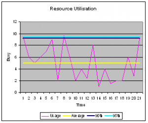
A more appropriate measurement that can be used for resource utilisation is the percentile. The average that was described above is effectively the 50th percentile. That is, it identifies the value at which you can state that 50% of measurements are below. For our purposes a 90th or 95th percentile is a really good value to report.
As the picture to the right shows, the 90th percentile is very close to the very top of th e measured values. There are some measurements that are higher still, but nearly everything else is under the 90th percentile value. This is very useful when reporting system performance, since it provides a value that is effectively the “highest” measurement, but it ignores the outlier (which might well be caused by some random effect, and not normal activity).
The 95th percentile is even closer to the maximum observed value. Using the previous definition of a percentile, this tells the reader that 95 percent of all measurements were below this value.
Excel has a handy function for reporting percentiles, called: PERCENTILE. It is well worth investigating. Later on this year, I will look into the different ways that percentiles are calculated (there are subtle differences).
